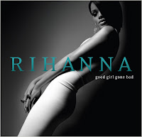
 Album Cover 1. Rihanna
There is a long shot of Rihanna who is posing and leaning across the front cover. She is in a white dress which could convey her innocence however the dark shadows behind her body show a darker side as if she is hiding something. This can relate to the title, 'good girl gone bad'. Although the colours are in black and white we can still see that the way she is posing shows alot of flesh and and she looks very seductive. She looks straight at the consumer giving direct address and makes it more personal. The lighting behind her body is darker and there is light which highlights the front side down her body. Overall the cover is quite minimal so the image of Rihanna is the main focus.
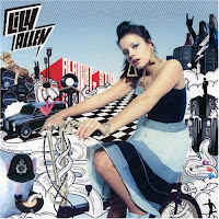
 Album Cover 2. Lily Allen
 There is a mid shot of Lily Allen who stands out on the front cover infront of the busy background and seems to be posing on a push bike. The push bike, like the rest of the background is dull colours with patterns and shapes and has a more lively and cartoon effect. The title of the album is set to look like in the background of the picture effect created and is in bold red writing to stand out. Her name is positioned in bold slanted writing oulined in a white and almost looks like a speech bubble. Lily allen is portrayed to look feminine in her dress and dramatic jewellery but looks more bolder sat on a bike which isnt very lady like.
 Album Cover 3. Leona Lewis This is a close up of Leona and she takes up the whole of the front cover. She has a lot of light on her face and big curly hair. She wears subtle makeup and outlines her eyes, looking very feminine. She looks straight at the consumer giving direct address. At the bottom it gives the name of the album cover, 'spirit' and by the shades around her eyes they look innocent and deep.
 Album 4. Mario This is a close up of Mario which takes up the cover. In this photo Mario is wearing white which could be symbolising his wealth,as he seems to be wearing a jacket / shirt with a black tie. By the way he is positioned, his hands are up against his face. By wearing dark shades it seems to be he is hiding behind them & makes the viewers curious. The main colors used are white, and then his name is clearly highlighted in a bold yellow. The name of his album is not so clear as it is white and smaller than his name but still visible. This cover is simple but inviting as we are attracted by the positioning and curiousity.


